3 Tips for Optimizing Landing Pages
When we are going to develop a new landing page or want to optimize an existing one there are several considerations that must be taken into account.
Most of us react in a very similar way to stimuli and basic messages, taking them into account helps us so that the message that we want to convey through our landing pages is better fixed in the mind of the user.
While there are many considerations to take into account when designing a new landing page, there are 3 particularly important considerations to take into account so that our message is clearly interpreted.
1) Provide clear and simple options
The brain remembers 3-4 options well at the same time. In a landing page you should not sin to provide excess information to the user, since normally the only thing that is achieved with that is to confuse the user.
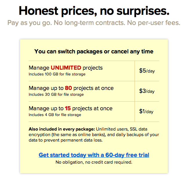
If we must present options from different plans or show the benefits of our product / service, the ideal is to think about showing only 3 or 4 options at most to achieve the greatest impact.
If we prefer that users choose one of the options over the others, we must highlight it with a larger font size, another background color, put the option first in the list, etc.
Basecamp.com is a very good example that is often presented when talking about good landing pages.
 Which brings us to the next point.
2) Show highest priced items first
The brain works in a comparative way, no price is very expensive or very cheap without a reference. In the previous example of Basecamp you can see how they first list the most expensive plan and then the cheapest options.
Listing the highest priced items first helps them to be selected more frequently, the products should ideally be listed in descending order of price.
3) Create a sense of belonging
Normally people buy products or services to "belong" to a social group, this is especially relevant in products of the aspirational type.
There are many ways that people can relate to:
1) The type of car they drive.
2) The type of computer, smartphone or operating system they use.
3) The activities they do outdoors.
4) Artistic aspirations.
5) Body type and physical or mental conditions in general.
Recognizing what our users can identify with or what their aspirations are helps to write better content for our landing pages and therefore improve conversions and user interaction.
