9 practices to create eye-catching content for your digital channels
Social media posts are a great way to grab your audience's attention. However, due to the large amount of content that users consume on a daily basis, it is important that you make your pieces stand out.
Whether you are selling a product or offering a service, to create your personal brand you need to know what your audience is looking for and then surprise them with eye-catching content. For this reason I present these 9 tips to make your content the favorite of your target audience.
- Use the right tools
The first step is to create powerful visual content so that your audience pays attention to you and you can generate a very good impact.
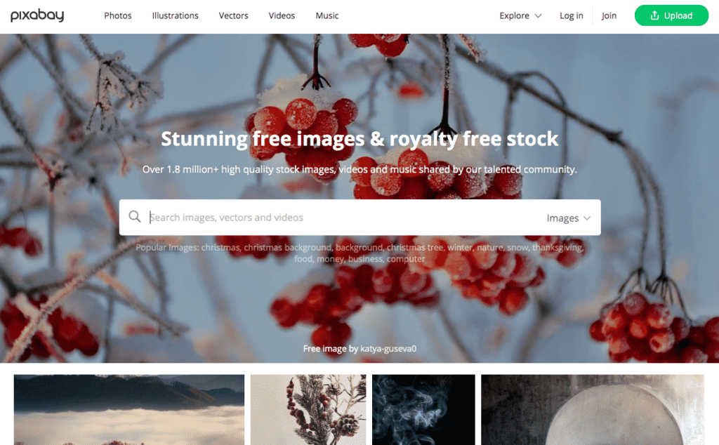
For example, if you want to use a photo to accompany your brand communications, you can make your own production or obtain high-quality material from sites such as Unsplash, Pixabay, and Pexels, which offer extensive libraries of free images and photos.
Using these image banks instead of downloading photos from Google gives you the peace of mind that you can create your content without having to pay fees for the use of third-party images in the future.

Similarly, the platform on which you create your content is very important. That is why I recommend you Vismae, with which you can work in the cloud and you can design pieces of image, video and infographics.
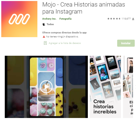
If you want to create custom stories, I also recommend Mojo where you can use your own brand elements.

Finally, I recommend Canva, which is the favorite of many since it is an incredible tool to edit images and do almost anything. There you can use templates in which you only have to place your text and photos and even create some animations.
These are just some of the semi-professional tools that you can use to get started today and take your brand image to another level.
- Give the correct size to your images according to the network in which you publish them
Giving your images the correct aspect ratio and size allows your audience to see the quality of your work firsthand.
However, it is true that it can take a lot of work to adapt each piece of content to the format of each social network. That is why I recommend that you optimize your efforts based on your productive capacity and if you want to publish, for example on Twitter and Instagram, evaluate where your audience is and whether or not it is worth making such a change.
If you want to know the specific measures of each social network, I invite you to read this Article in which I explain it in detail.
- Make sure you have permission to use other people's images on social media.
This point goes beyond using Google images instead of banks like the ones I mentioned in point 1. It is also about taking into account the mentions and labels of users or simply when someone shares a photo in which your product appears or brand. Remember that whenever possible you should request permission from the owner of the photograph so as not to infringe any copyright law.
Keep in mind that in addition to having to delete the publication or pay a fine for the unauthorized use of an image, if a situation of these is made public it can easily damage the reputation of your brand.
- Make your images representative of your audience.
In the event that your communications include the image of people, keep in mind that your users are more likely to pay attention if they feel identified with that character.
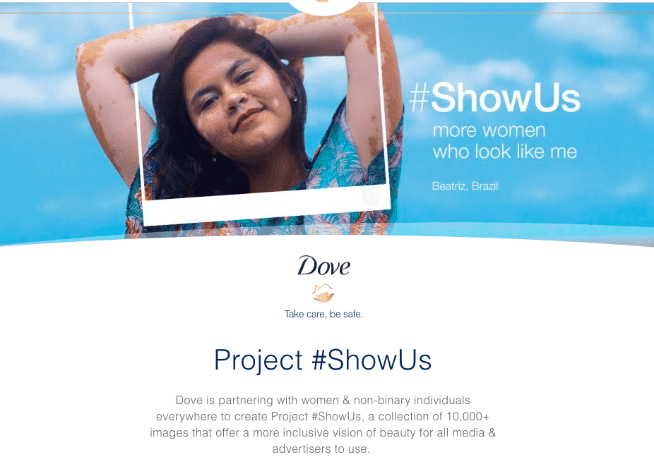
Dove, for example, is a specialist in showing "real women" in its publications and this type of communication allows you to connect more intimately with your audience.

- Identify the visual parameters of your brand
Although it is true that it is not necessary that you have a designer degree to make the publications of your social networks, I recommend that you define some basic elements that give a line and visual identity to your communications.
Colour
In addition to choosing the representative colors of your brand, you can create a system of complementary colors that show the personality and tone of your communication. Keep in mind that some colors are striking, while others are relaxing or may even be associated with certain emotions. Select the colors based on the purpose of your brand to accompany the narrative of all your communications.

Balance
There are many ways to create balance, be it from objects, blanks, textures, or the amount of light in a particular image. When you are doing your posts, feel free to play with different elements that have symmetrical and asymmetric balance.
To achieve this, I recommend that you combine large objects with other smaller ones or play with the use of lights and shadows to combine your space.
Hierarchy
This design concept consists of creating emphasis on the most important part of an image and then adding the rest of the elements that accompany your publication.
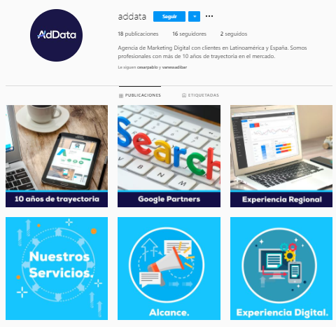
One of the best ways to see this example is on the pieces that have text within the image.
In this example, the large print captures the user's attention first, and then the eye moves to the smaller items. This use of visual hierarchy allows you to draw your audience's attention to what is most important.

- Use words in your social media images
For this tip it is important that you incorporate the concept of hierarchy from the previous point and take advantage of the benefits of telling your audience a little more about the topic of your publication.
The key here is not to oversaturate your audience with too much information or even too much text. Also make sure that the image that accompanies your publication is strongly related to the text and that it does not visually compete with the letters.
The challenge of this type of content is to make it visually attractive so that your audience wants to share it, so I recommend that you be clear and concise with the message you want to convey.
- Maintain homogeneity in all your elements.
Whether you decide to use warm colors or a script typeface, it is very important that you maintain visual consistency in all the elements that make up your communications.
This concept is very powerful since giving an identity to your pieces allows your audience to recognize you more easily and in this way have a better relationship with your content.
- Enhance your brand in your posts
Some companies with well-executed brand manuals place special emphasis on using small watermarks, logos, and other typical elements of their corporate image, in order to enhance their company name.
At this point I recommend that you use canva and insert your logo respecting the specific guidelines that you want to execute in your publications.
Placing your brand on each image is a very personal decision, but it can be very beneficial if you do, especially if you know that your audience shares your content.
- Give variety to your content
Giving homogeneity to your communications is important, as well as giving variety to your content. For this I recommend using and defining certain visual elements, types of images and types of video.
At this point I recommend that you make a table in which you define what formats you are going to use (image, video, infographic), what visual elements and what content or theme lines. Planning your publications in advance will help you to give variety and homogeneity to your profiles.

Conclution
Communicating with your audience efficiently begins with a broad understanding of your audience's needs, interests, behaviors, attitudes, and opinions. Use this information to know what type of communication is most interesting for them and thus, plan your publications based on all the visual elements that make up your brand.
Use these 9 tips to improve your communications, but keep in mind that everything you do from the visual must respond to a marketing objective. I recommend that you review your strategy and implement those points that may be most useful to you.