How to automate reports with Google Data Studio
Have you ever heard of "Data Paralysis"? It is the moment in which there is a large amount of data, but no conclusions about the relevant information that these data provide, that is, the data does not answer questions or does not provide significant conclusions.
If this has ever happened to you, it could also be because too much time is often spent manually collecting data, cleaning data, and manually creating reports, rather than giving more time to data analysis.
Time is our most valuable resource and that's why optimizing reports led me to work with Google's Data Studio. I tell you some of the advantages:
- It's free, you only need a Google account and unlimited reports can be generated.
- Versatile, it can be configured according to the needs of each person.
- Consolidate data from different sources and platforms in one place.
- Permissions and accesses can be shared.
- Like all Google products, you can collaborate in real time.
- It is dynamic, it accesses the data in the moment.
- Reports can be exported in PDF.
How to use it?
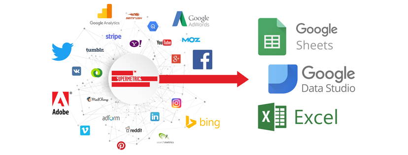
It can be done through the Add-on Supermetrics for Google Sheets.

Or through the Data Studio Connectors.

Either option is highly efficient in the time spent collecting data.
How to create a report? Let's see step by step how to do it.
1. Login to https://datastudio.google.com/ and create a new report

2. Create a new data source

3. Select a connector and add it to the report. You can choose between the most important platforms, Google Analytics, Google Ads, Facebook, Twitter etc.
4. Drag and drop. When the information has been added, you can find it in the right column. After that drag the type of chart you want to see on the spreadsheet. 
5. Modify the data according to your needs. You can even select whether you want to add total values or percentages, which is very useful for comparing performance between periods.

6. Choose a style for the dashboard

7. Share it

Finally, I would like to show you how the final result is. This is an example of what a general dashboard would look like, using LinkedIn Ads, Twitter Ads, Facebook Ads, Google Ads and finally Google Analytics.

And this is an example of a performance comparison between Google Ads vs. Facebook Ads.

As you can see, it is a relief to stop manually collecting the information and spend that time doing an in-depth analysis. For those who in the first week of the month suffer to complete all the reports of the previous month, this will mean a much more efficient use of time, which we can dedicate to anything else, whether it is generating new proposals for our clients, optimizing the existing campaigns or perhaps have more time for a coffee break. 🙂