How to create automated marketing reports with Google Slides in 5 simple steps
If you work in marketing, you have surely copied and pasted data from Facebook Ads, Google Analytics, HubSpot and other sources in Google or Powerpoint presentations on more than one occasion to present your results.
If you've been through this process, you probably agree that manually copying this information can take a great deal of time. What's even worse is that in this way of reporting you are exposed to making mistakes.
It is for this reason that I present to you a convenient way to automate the process of combining:
- Google Spreadsheets (Sheets).
- Supermetrics for Google Sheets
- Google Slides
Below I will guide you through the step by step to automate the way you present the information to your customers.
- Get the data you need in a spreadsheet.
To keep this example simple, let's say you are creating a monthly presentation on Google Slides about the performance of social media posts on Facebook or any other platform.
The first thing you should do is run a basic query with Supermetrics for Google Sheets, to extract all the raw data that you want to include in your report.
If you don't have Supermetrics for Google Sheets yet, you can install it at this link.
This is how your query should look.
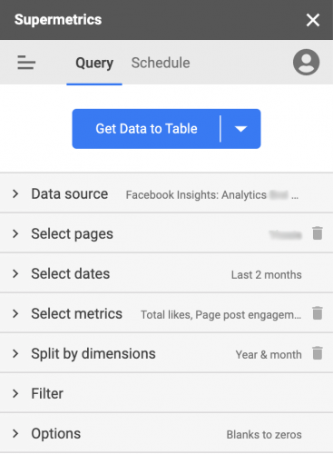
In this example, I am using Supermetrics to get the following data:
- Data origin: Facebook Insights
- Select accounts: yours or your client's.
- Select dates: The last two months.
- Select metrics: total likes, participation in page publications, content consumption and total impressions.
- Divide by dimensions: Divide columns: Year and month.
- Filter: None
- Options: Replace blank metrics with zero values.
Once you have made your queries, click on "Get the table" and wait for the download to finish. Your spreadsheet will look like this.

However, since you probably don't want to share this raw information with your clients, I recommend that you format it before your final presentation.
- Add a percent change formula and format your table.
Next, you will create a percent variance formula to the right of your Supermetrics query. This formula calculates the month-to-month difference of the metrics you have obtained. A simple formula you can use is "(Current Month / Previous Month) -1". In this particular worksheet, this means that: (C2 / B2) -1.
Here you will want to apply all the formatting to your Google Sheets table as this is the exact table that you will eventually copy into your Google Slides report.
For example, you will want to add some conditional formatting to your MoM column to highlight any positive number in green and in turn, any negative number in red.
Your final table should look something like this:

Before copying the table, let's see how to highlight in your report the best / worst performance of your publications, landings, etc.
- Find the best performing ads / posts.
In addition to month-over-month performance, you'll also want to highlight the best posts, ads, or landing pages in your reports.
In this Supermetrics query, we pulled in the top 5 Facebook posts from the previous month, based on those with the most engagement. Here's the Supermetrics query you can use to get this:
- Data origin: Facebook Insights
- Selected accounts: Your account or that of your client.
- Selected dates: Last month.
- Selected Metrics: All Post Engagements, Post Link Clicks, Video Views, Post Impressions.
- Divide By Dimensions: Divide In Rows: Date, Post Link, Post Post
- Number of rows to search.
- Sort rows: Total subsequent reactions.
- Sort direction: Descending.
- Secondary order: Automatic.
- Filter: none.
- Options: Replace blank metrics with zero values.
Start your query by clicking "Get data table" and wait until it is finished. You should see a table that looks like the following:

Again you will want to format the table so that it looks good in your final report. For this case, instead of formatting and getting the data directly from Supermetrics, use the formula "=" a few rows below your data extraction to replicate it. Example: In cell B9 have a formula that is "= A1".
To save space when placing it on a Google sheet, you can use the HIPERLINK () function to join the "link to a post" and the "message from a post" in one column. The formula will look for something like HYPERLINK ("link to a post", "message from a post") or as seen in the spreadsheet = HYPERLINK (B2, C2).
Once you have added the format to your table it should look like the following image.

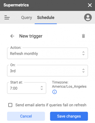
- Schedule data updates with Supermetrics
To make sure you don't have to build this same report manually in the future, your next step is to schedule automatic updates with the Supermetrics sidebar.
It is always a good idea to wait for two or three days to get results from previous periods, to ensure that the most accurate data conversion is available.
In this case, since we are creating a monthly report, the schedule should look like the following image.
- Bring your tables to your report, in a Google presentation.
Once you have configured your report and created the updates, it is time to copy the tables that you created to your final report in a Google presentation. There be sure to choose "link to a post" while pasting each table. This selection will allow you to refresh all your tables in a single action when updating your reports.

Once you've copied your pivot table for each period and your top 5 posts table, your Google presentation report should look like the following image.

This process must be repeated for all the channels and data points that you want to include in your report.

Now all you have to do is copy and refresh your Google presentation once a month. From now on, updating data in your Google presentation report will be much easier.
After every schedule and update of your Google spreadsheets, you can follow these simple steps.
- Get a copy of the Google presentation with your report from the previous month, to make sure you are not overwriting the previous presentation.
- Make sure to find and replace the name of the period or month on all the slides. For example, change December 2020 to January 2021.
- Open the "link object" in the sidebar by right clicking on any of the tables and then clicking "refresh all".
I hope that this way of creating reports will be useful for you so that you can focus on obtaining information and analyzing it, instead of spending your time designing your presentations.
